
Unsplash: Free images for commercial use
High-quality images are an important part of any online message you want to deliver. Free images that you can use on your website and with social media postings must either be your own originals, those that you have permission to use, or donated by artists to use free for commercial use.
I first discovered Pixabay.com, where I've found many beautiful images. Then thanks to visual marketer LouiseM.com, I discovered Unsplash.com, a site that has many stunning high-resolution images that are also free to use without attribution.
I’ve used Unsplash for many projects over the years and I’ve recommended the service to many clients. But I’ve learned that in October 2022 parent company Getty Images initiated a paid Unsplash+ subscription service where “even more” images are going to be available. That defeats the purpose of a free image service, which had been wonderful for budget-minded clients!
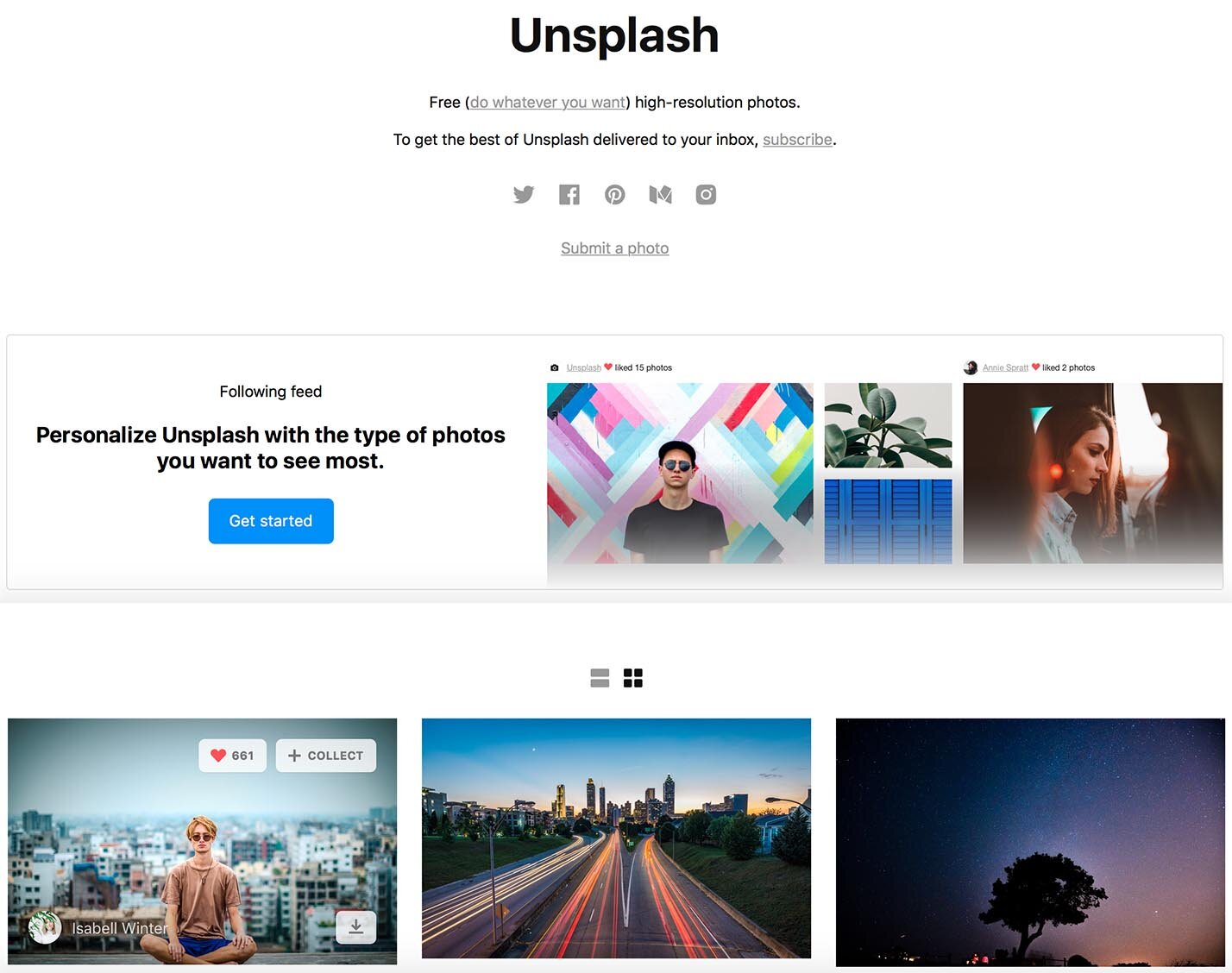
I love to combine text and images in inspiring and impactful ways, but I'm no photographer, so I'm grateful there are artists out there donating their images free for commercial use. Only time will tell if I’ll continue to recommend Unsplash to people who are looking for beautiful free images. Pexels.com is another service that I’ve heard good things about and may look into that too.
Getty Images Press Release, 10/5/22
[updated 11/20/22 to mention the paid subscription service Unsplash+]


Optimized photos load more quickly and improve SEO (search engine optimization) for your website, without sacrificing quality. Techniques for optimization include resizing and compressing the photo to reduce the file size while maintaining sharpness and clarity.

Adding links to your website gives people a convenient way to learn more about a subject that interests them. Links can be built into text, buttons, or images. Learn more about the guidelines I go by when deciding which type of link to use.

Writing, styling, and placing headings on a website page takes planning and intention. Use readable headings with just one Heading 1 per page and then Heading 2 and 3 as needed to outline the content.

Whether your website is new or has been around a while, decluttering the content to encourage visitors to browse is always a good idea.

Whether you design your website on Squarespace or some other platform, you’ll be making color choices that are unified and compatible across your website, from the text to the buttons to the colors in the images. Designers call these color choices a color palette. Here’s how I simplify color selections for my clients.

Like the receptionist and reception area in an office, the Home page is the greeting area that needs to contain enough cues to reassure visitors that they're in the right place and give them guidance about how to find what they need and what to do now that they're there.

Whether you want to archive a page for posterity or for your future use, here are the instructions for properly archiving the page without causing 404 Page Not Found errors on your Squarespace website.

To stretch and expand the background image to the top of your website, change the site header color style to Adaptive. The site header then becomes transparent so the background image shows behind the navigation text.

The clickable image that shows up on social media posts is called a link preview image. In Squarespace and other website editors, you can designate a specific image to show up when you share a website page on Facebook, LinkedIn, or Twitter/X.

The aspect ratio of an image is its width relative to its height. Understanding aspect ratio helps you design your pages with images that look attractive and well-matched. Aspect ratio choices can also help with planning and choosing images you’d like to use on your website.

Being able to preview your website live without logging out of Squarespace is a convenience for testing and proofreading before you launch.

You can add a Social Sharing image to Squarespace to be shown as a link preview for your website when you share a URL on Facebook, LinkedIn, and Twitter. The size of 1200x628 pixels works best for those platforms. You can also set custom images for specific website pages or blog posts to draw extra attention to them.

A footer is the last section of information at the bottom of a website page. Use this valuable area to show contact information, add links to website pages, and ask visitors to take action on their way to becoming loyal customers.

Here are my 10 favorite text tips to help you create a modern and professional-looking website on Squarespace or any other website platform.

As I worked with clients, I noticed there were six words that came up in questions to me during our consultations: domain, web host, website, page, SEO, and navigation. Becoming familiar with these website components and how they work together helps you manage and maintain a healthy website for your business.

Two kinds of forms are common on websites: a Contact form and an Email signup form. Each form has its own purpose. To plan which forms will go on your website, it’s helpful to understand how each form is used as an interactive tool for collecting information from your website visitors.

As you start a blog, first determine the focus of your blog. Then choose topics that are relevant and that are in your area of expertise. Blog posts can contain text, images, videos, links to other blog posts, links to podcasts, and personal or creative endeavors. Each blog post adds content to your website and gives you cumulative client-attracting and SEO benefits.
 Kerry A. Thompson
You don’t need a big agency to get your website done. You just need the one right person. I offer Squarespace website design and content development services for creatives, coaches, and healers. Learn more in a free 30-minute consultation.