Five ways to speed up your design time
I always love it when I find something that speeds up repetitive tasks. So when I discovered the shortcut of copying website pages to create new ones early on in my website design career, I was sold.
Here’s what I learned about copying pages
I copy pages during the design process for a variety of purposes. Some of these uses may not have occurred to you, so I wanted to gather them here in one place for you to consider. And thanks to my clients being willing to show their websites as real-life examples, I can not only explain how to use these tricks, but show you too.
Here are the five ways I copy pages in Squarespace to save me time.
#1: Copy a website page to create similar ones
This was the first technique I used and still use it on every project I work on. Most websites have more than one page with the same design as another page—with the same margins, number of columns, placement of images, and perhaps repeated headings, text, or buttons. Instead of having to painstakingly re-create all those elements on a page, you can copy a similar page. Then you'll have most of the elements in place already and need only update the new page with its own text and images, change the navigation and page title, and assign a unique URL.
My client Ellen Petersen of Nourishing Life Qigong offers five different services, each on its own page. She had a lot of information she wanted to convey about each service, including its health benefits and what a session is like. We settled on a page design for each of these pages that has a large banner image and quote at the top of the page, multiple columns of descriptive text with similar headings, a Schedule a Session button, and a few images that accompany the descriptive design. After designing the first page, I was able to copy that page and adapt it for the other four services. The page design has a lot of elements, so copying a page to make a start on the next one was a great time-saver.
I also used this technique for Robert Perron, a writer whose website highlights excerpts from his novel. Each excerpt has the same design with wide margins, horizontal lines at the beginning and end, and a pair of Previous and Next links that cycle through the excerpt pages. Each page was copied from the first Excerpt page. I then replaced the text with the text of the new excerpt and updated the Previous and Next links to go to the correct excerpt in the sequence.
#2: Copy a website page to test and review changes
If I want to try out a new design or I want to show a design change to a client, I'll copy the page I want to change and work from the copy. This ensures that the original page remains untouched. To keep the page hidden from the live website, I put the page in the Not Linked section of the Squarespace pages list. To see this page or to show it to a client, I must save the page in Squarespace.
To see the review page, my client types in its full URL in a browser (its full web address) to open the page to see it as it would appear to a website visitor. My client can then give me feedback and changes for the page. I can also look at the review page to see how it looks and to check that links and buttons work.
Tip: When you copy a page, a URL is assigned automatically. You can see the page URL on Squarespace in the URL Slug field of the new page's Settings. To get the full URL for a page, combine your website name, a forward slash, and the page URL. So to get to a copy of my Squarespace Home page, the full URL might be something like https://kerryathompson.com/home-1.
My client Celebration of Reiki, Inc. changed its Home page frequently to add news of upcoming events or to make announcements. If there were changes that needed to be reviewed first, I'd make a copy of the Home page, add the changes, have my client review it, and then when it was approved, I'd make those changes on the live Home page. Here's an example of a review page (on Weebly) I sent out asking for a review of the new image announcing the next conference before I added it to the live Home page.
#3: Create a backup of a page before changing it
Sometimes you learn how to do something by making mistakes. I had a few panicked situations when I was first learning how to move elements around on a page where things got irretrievably messed up and I had accidentally saved it in Squarespace. I would have to quickly design the page again. After learning the hard way, I started making a backup copy of any page that I was going to be making big changes to...just in case. If things went bad on the design changes on the live page, I could always use the backup as a replacement (updating its URL and page/navigation title to match the original).
Here's an example from a previous version of my own website. I was going to be trying out some changes to my Home page. Although I was confident enough to work on the live page, it was nice to know I had a backup copy to fall back on if necessary.
#4: Create a placeholder template for future pages
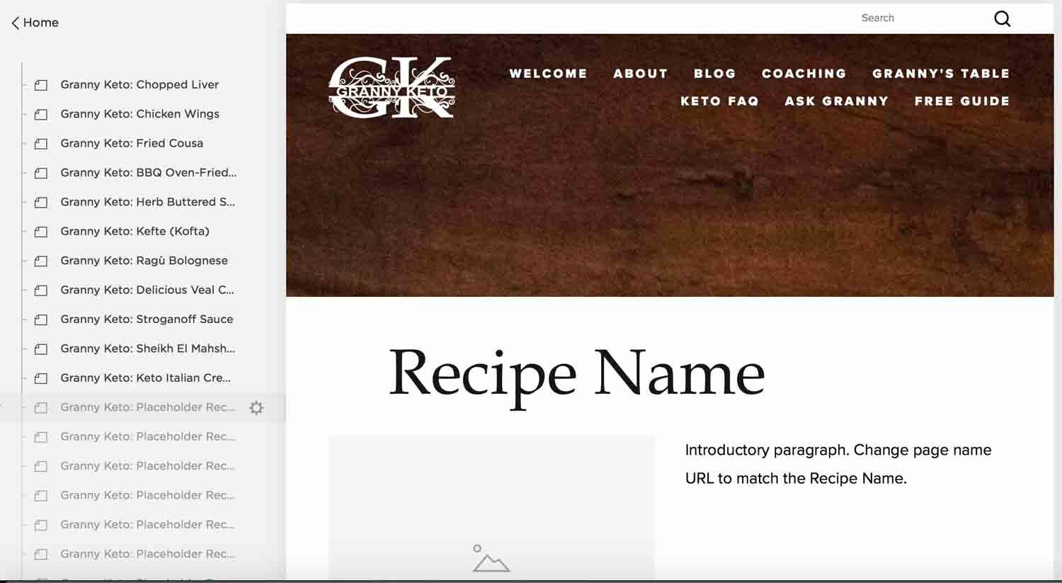
I've had several clients recently who plan to continually add to their websites with pages of the same design. As a convenience, I've started making placeholder pages that serve as a template to keep the design and elements the same when making a new page that must match the others. The placeholder templates are hidden (moved to the Not Linked section and disabled in Squarespace). Each placeholder template page has a placeholder title and URL, which is updated with a real title and URL when adding the text and images for the real page.
My client Miriam Hatoum, when she ran GrannyKeto.com, had a Recipes section on her website and she regularly added new recipes. Each recipe had a consistent formatting style, with an image and an introduction first, ingredients and directions next, and nutritional information at the end. The placeholder pages I made had the headings in place, a placeholder for an image, and some tips in the text about how to add to the page.
Another handy placeholder template was the online form that was used for events for my client Celebration of Reiki, Inc. Forms were time-consuming to create, so having a ready-made form with most or all of the fields that were needed for events saved me time. This example was done in Weebly, but the same could be achieved with a form placed on a page in Squarespace.
#5: Create an archive copy of a retired page
The final idea I have to share with you is that you can make a copy of a page for recordkeeping. I don't use this technique on my own website, but I have a couple of clients who find it handy to see an older page with text and images from a particular point in time. The clients I know who use this kind of archiving tend to run events that are similar from year to year. Having a record of what a page looked like at a particular point in time, including having images and descriptions of the event, the venue, vendors, or presenters or having a copy of an old registration form, can be handy for referring to when it's time to create pages for a new event.
For my client Celebration of Reiki, Inc., I organized the archived pages by date. There were several events a year and each event had several pages associated with it. By organizing the archive copies in folders by year, it was easy to find an archive page from a certain event. These pages were renamed with the prefix “OLD” and hidden from view. This example shows a Weebly website, but you can add a Folder to the If I had been working in Squarespace, I would add a Folder to the Not Linked section, then drag and drop the archived page under the folder. I would also hide and disable the page by unchecking "Enabled" as a page setting.
You now know everything I know about why you'd want to master the shortcut of copying pages on your website. If you can think of other ways to use copied pages that I haven't thought of, I'd love to hear from you!


