
Quit telling me to "submit" on your Squarespace Contact form
If you're going to create a Contact form on your website, do me a favor, will you? Change the default button label to anything other than "Submit."
It's a pet peeve of mine. Squarespace uses the word "Submit" as the default button text and I hate that word on a form I'm filling out. I might like to send you a message but I'm certainly not going to "submit" to anything.
Use the word Send
All my clients' Contact, Scheduling, and Booking forms always use the word "Send." I never ask them if they'd prefer me to change the button text. I just go ahead and do it, sending out a little more friendliness with every form.
Or make it more creative
And if plain old "Send" is too boring for you, you can always get creative with your missive directive:
"Let's do this!"
"All set!"
"Can't wait to hear from you"
"Let it fly"
"Dispatch posthaste”
“Yes, please!”
So, where do you change the Submit button text?
All my clients' Contact, Scheduling, and Booking forms always use the word "Send." I never ask them if they'd prefer me to change the button text. I just go ahead and do it, sending out a little more friendliness with every form.
So, where do you change the Submit button text?
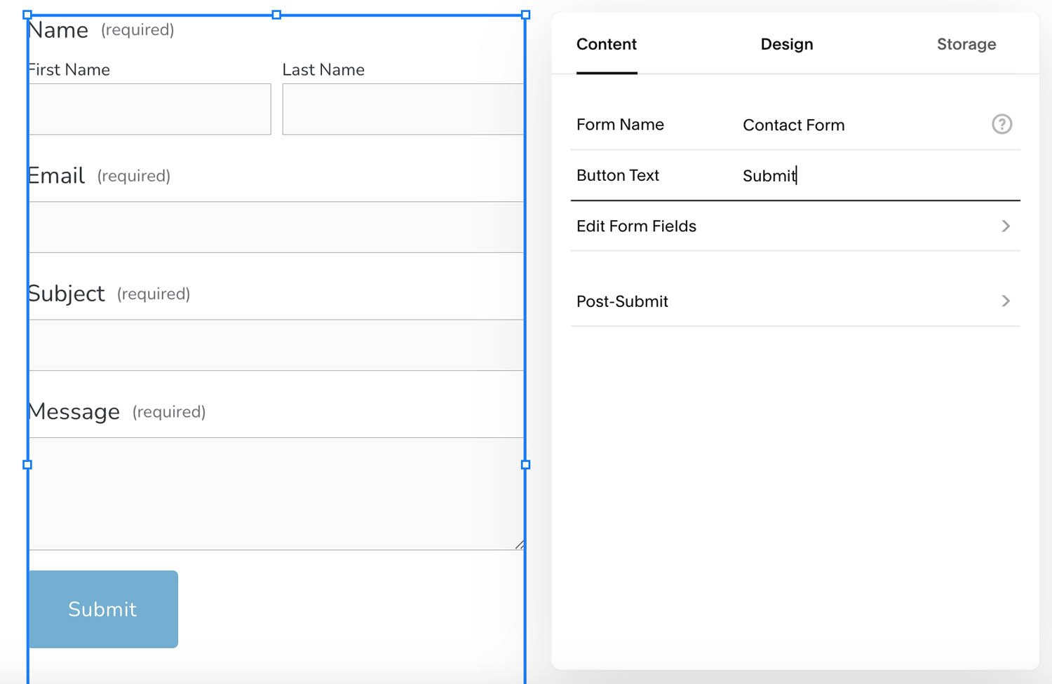
In Squarespace, open the form to edit it, go to the Content options, and change the button text.
Please make the internet a happier place by not submitting to that dreary word the next time you create a Contact form. Your clients will appreciate it.

Adding links to your website gives people a convenient way to learn more about a subject that interests them. Links can be built into text, buttons, or images. Learn more about the guidelines I go by when deciding which type of link to use.

Whether your website is new or has been around a while, decluttering the content to encourage visitors to browse is always a good idea.

Whether you design your website on Squarespace or some other platform, you’ll be making color choices that are unified and compatible across your website, from the text to the buttons to the colors in the images. Designers call these color choices a color palette. Here’s how I simplify color selections for my clients.

Like the receptionist and reception area in an office, the Home page is the greeting area that needs to contain enough cues to reassure visitors that they're in the right place and give them guidance about how to find what they need and what to do now that they're there.

Squarespace assigns every new website a built-in domain, a Site ID, that ends with “squarespace.com.” I recommend changing the random ID Squarespace assigns to be something you’ll remember.
Understanding in advance how your website will support your business will inform your website's design and content.

The aspect ratio of an image is its width relative to its height. Understanding aspect ratio helps you design your pages with images that look attractive and well-matched. Aspect ratio choices can also help with planning and choosing images you’d like to use on your website.

As a Squarespace Circle Member, I bring lots of benefits to my clients’ projects through the supportive professional community I belong to. As my client, you also get direct benefits I pass on to you, like an extended 6-month trial period and 20% off your first annual purchase.

Being able to preview your website live without logging out of Squarespace is a convenience for testing and proofreading before you launch.

Squarespace and Square are two different companies. They both support online stores, so it can be confusing when you are doing research about getting your business online. Squarespace is my favorite website builder, so this blog post will explain how it’s different from the company called Square.

A footer is the last section of information at the bottom of a website page. Use this valuable area to show contact information, add links to website pages, and ask visitors to take action on their way to becoming loyal customers.

Here are my 10 favorite text tips to help you create a modern and professional-looking website on Squarespace or any other website platform.

One of the first decisions you'll make with a new website is the choice of typefaces, especially those used as display accents throughout your site, such as the Site Title and Headings. Your website probably includes typefaces that suit the design template you chose, but if you would prefer another typeface, there are many to choose from.

Spacers are invisible design elements that add blank space to any part of a website page. I call them a website super power because they are incredibly useful for adding space around elements on a page.

Two kinds of forms are common on websites: a Contact form and an Email signup form. Each form has its own purpose. To plan which forms will go on your website, it’s helpful to understand how each form is used as an interactive tool for collecting information from your website visitors.

Understanding how text blocks work in Squarespace and how they interact with design blocks will help you shape your pages the way you want with indents, margins, columns, and more.

Choosing the main image on the home page of your website has repercussions for the colors, mood, and typeface choices for your whole website. Designers take a lot of things into consideration, including colors, size, and arrangement before choosing what's called a "hero image."
 Kerry A. Thompson
You don’t need a big agency to get your website done. You just need the one right person. I offer Squarespace website design and content development services for creatives, coaches, and healers. Learn more in a free 30-minute consultation.