
Parallax scrolling: love it or leave it?
If you’re using Squarespace 7.1, you can implement Parallax Scrolling by adding a background image and adding the Parallax image effect. You can read more about it here from a fellow Squarespace designer.
This post talks about Squarespace 7.0 templates.
A hallmark of stylish, modern websites seems to be the visual effect that uses a background image with text that scrolls over the image. When you scroll through what is usually a lengthy Welcome page, the background image scrolls more slowly than the text (scrolling in parallel, but more slowly). This effect is known as "Parallax Scrolling" and Squarespace 7.0 offers a number of templates that use it.
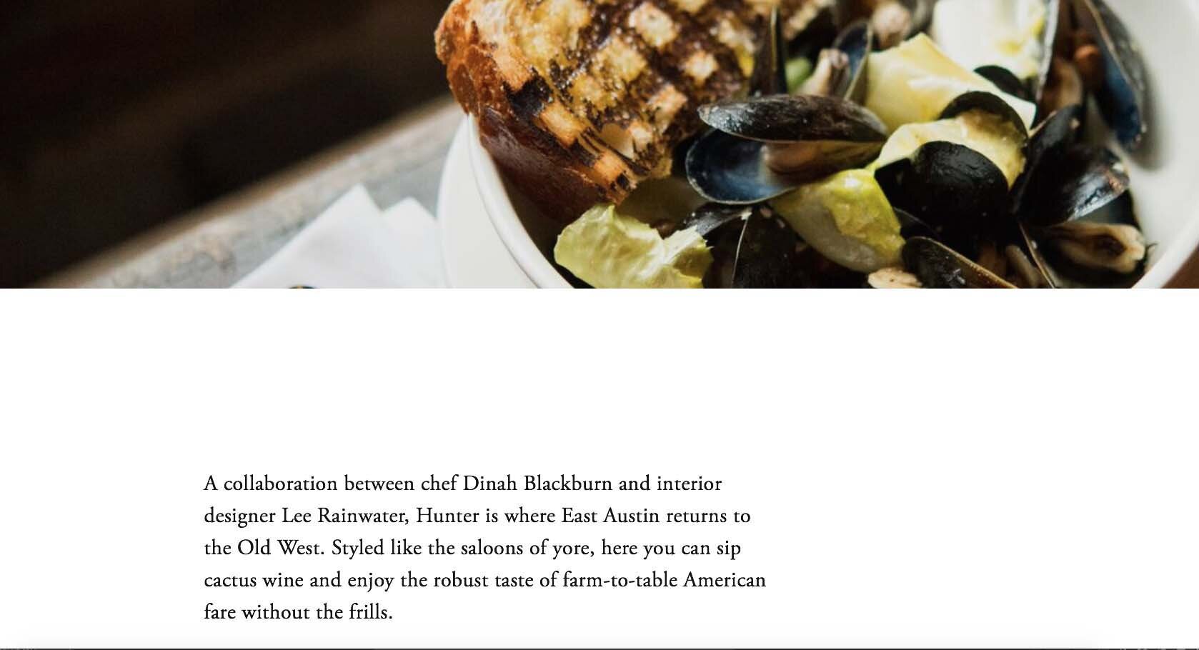
Parallax Scrolling is a visual effect in which the background image scrolls more slowly than the text that scrolls over it.
The Parallax Scrolling Index Page that Squarespace templates like Burke use looks like this demo.
A non-scrolling Welcome page is shown in this Montauk template demo.
I personally prefer a cleaner and quieter Home page without a lot of movement produced by parallax scrolling or video effects. I tend to avoid using such effects unless my client really loves them.

There are many different ways to manage registration and payments for events from your website. Squarespace has its own built-in features or you can connect to a third-party event management system.

There are four different phases in managing an event: Announcing, Registering, Collecting Payments, and Communicating. Each phase offers both easy, intermediate, and advanced ways to accomplish what you want to do. The system you choose depends on your time, your budget, and your comfort with technology.

Adding links to your website gives people a convenient way to learn more about a subject that interests them. Links can be built into text, buttons, or images. Learn more about the guidelines I go by when deciding which type of link to use.

Whether your website is new or has been around a while, decluttering the content to encourage visitors to browse is always a good idea.

Whether you design your website on Squarespace or some other platform, you’ll be making color choices that are unified and compatible across your website, from the text to the buttons to the colors in the images. Designers call these color choices a color palette. Here’s how I simplify color selections for my clients.

Like the receptionist and reception area in an office, the Home page is the greeting area that needs to contain enough cues to reassure visitors that they're in the right place and give them guidance about how to find what they need and what to do now that they're there.

Integrating automatic appointment scheduling with your website frees you from tedious back-and-forth conversations to set up appointments. I’ve tried and tested a number of scheduling programs and have two that I recommend to my website clients.

Squarespace assigns every new website a built-in domain, a Site ID, that ends with “squarespace.com.” I recommend changing the random ID Squarespace assigns to be something you’ll remember.
To stretch and expand the background image to the top of your website, change the site header color style to Adaptive. The site header then becomes transparent so the background image shows behind the navigation text.
Understanding in advance how your website will support your business will inform your website's design and content.

The aspect ratio of an image is its width relative to its height. Understanding aspect ratio helps you design your pages with images that look attractive and well-matched. Aspect ratio choices can also help with planning and choosing images you’d like to use on your website.

As a Squarespace Circle Member, I bring lots of benefits to my clients’ projects through the supportive professional community I belong to. As my client, you also get direct benefits I pass on to you, like an extended 6-month trial period and 20% off your first annual purchase.

Being able to preview your website live without logging out of Squarespace is a convenience for testing and proofreading before you launch.

You can add a Social Sharing image to Squarespace to be shown as a link preview for your website when you share a URL on Facebook, LinkedIn, and Twitter. The size of 1200x628 pixels works best for those platforms. You can also set custom images for specific website pages or blog posts to draw extra attention to them.

Squarespace lets you promote your blog post automatically on your connected social media accounts through the Share settings for the post.

Squarespace and Square are two different companies. They both support online stores, so it can be confusing when you are doing research about getting your business online. Squarespace is my favorite website builder, so this blog post will explain how it’s different from the company called Square.

Have you ever wished that you could take customers back to your website automatically after they make a payment through a PayPal button on your site? It turns out it’s not only possible, but it only takes a little extra planning and web design time.
 Kerry A. Thompson
You don’t need a big agency to get your website done. You just need the one right person. I offer Squarespace website design and content development services for creatives, coaches, and healers. Learn more in a free 30-minute consultation.